
Using a reference photo (selected from the outcome of a performative workshop) I experimented with different styles of painting. The unplanned nature of the reference photo allowed me to associate this context with the Cubism movement, which strays from the confines of realism.
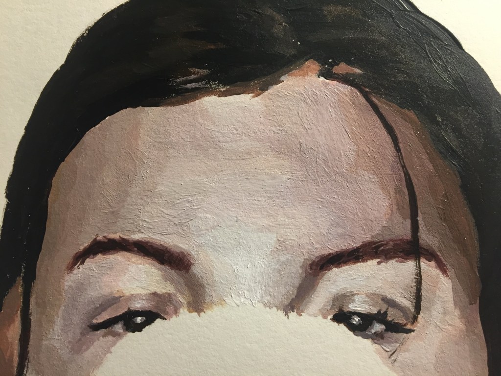
I firstly painted a section of the image in a more realistic style, as I thought this would give me an understanding of the colours involved when I moved into cubism. I left the balloon (object of interest and focal point of the photo) as negative space. This leaves the context of the image ambiguous when separate from the reference photo, which I found made the image more complex.
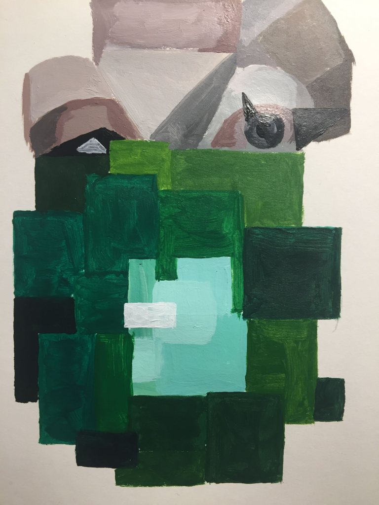
My second interpretation of the photograph was inspired by both traditional cubist artists and – predominantly – slightly later artists such as Jean Metzinger, who uses wider, flatter 2D shapes of block colour, which produces a piece closer to complete abstraction than that of Picasso’s cubist work. This produced an image that appears pixelated and removes obvious context.
I found I referred back to ‘Colour in the Everyday’ in my use of squares that represent the main colours in the image. This simplified the painting further which meant I could contrast my first painting even more.
