Non-Places: Photography
NON-PLACES: Analogue Development
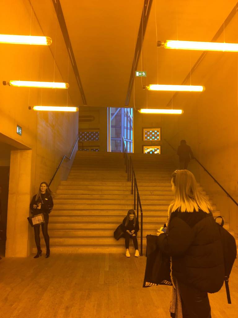
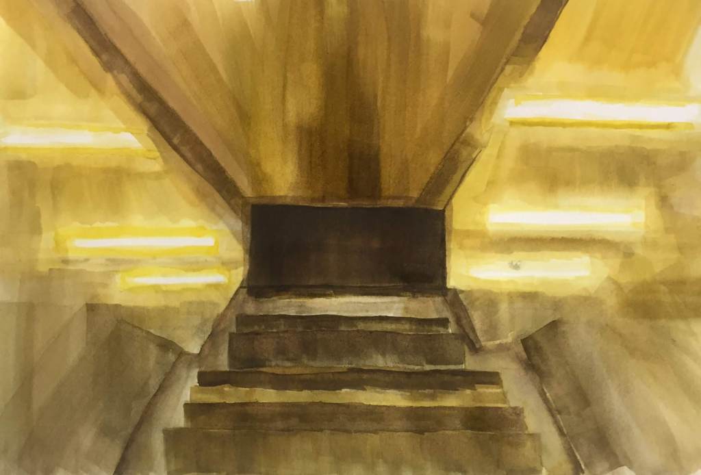
I took inspiration from my photography of the architecture at the Tate Modern to create a watercolour image. Referencing my original photo, I created an abstract representation of the empty place I viewed as a non-place. The staircase serves little purpose; the photo shows people sitting or standing while waiting. It could be seen as “excessive space”.
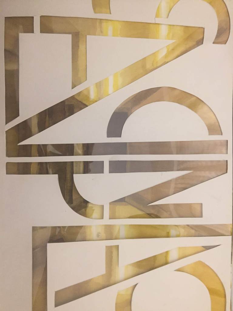
I used straight brush strokes to create a jarring atmosphere in my painting. I then started experimenting with type, using letters from the title to form an image, cutting them out of paper and laying this over the painting.
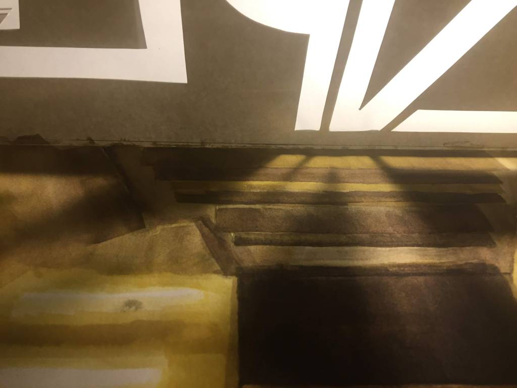
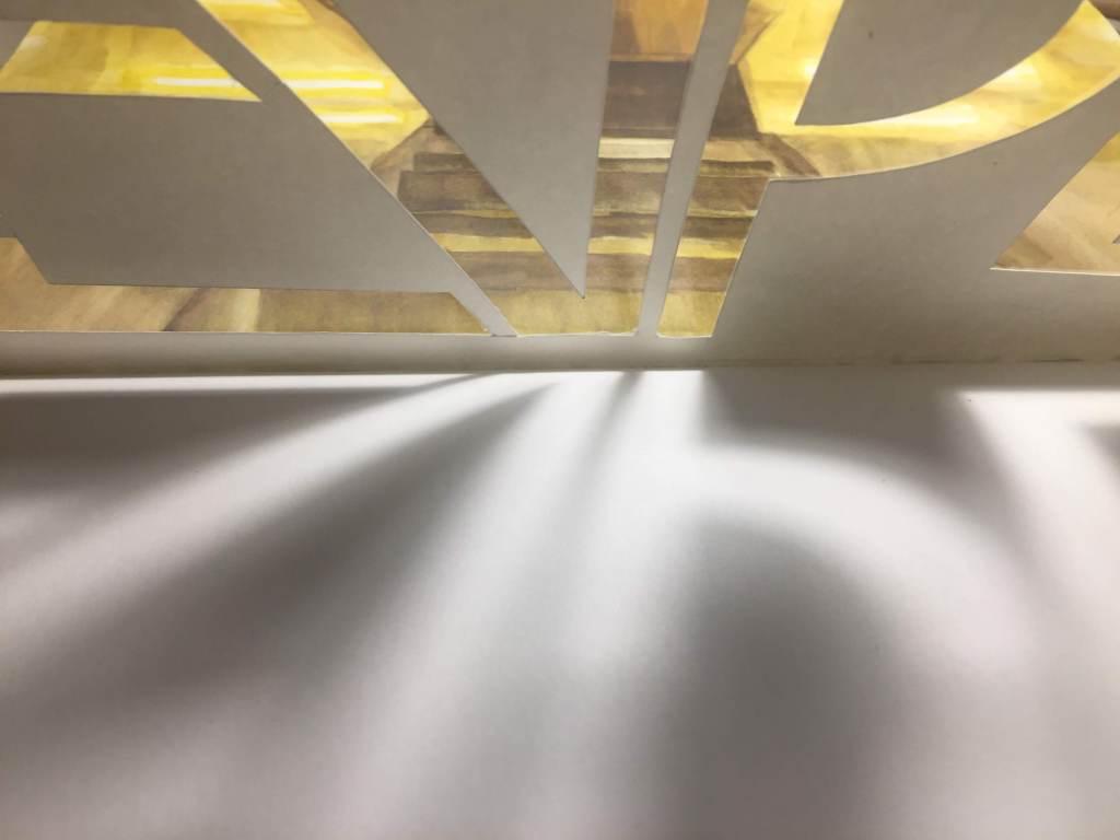
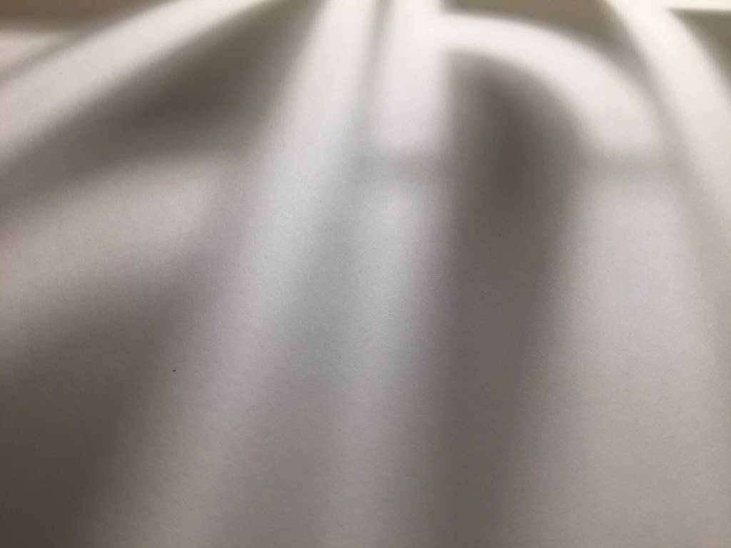
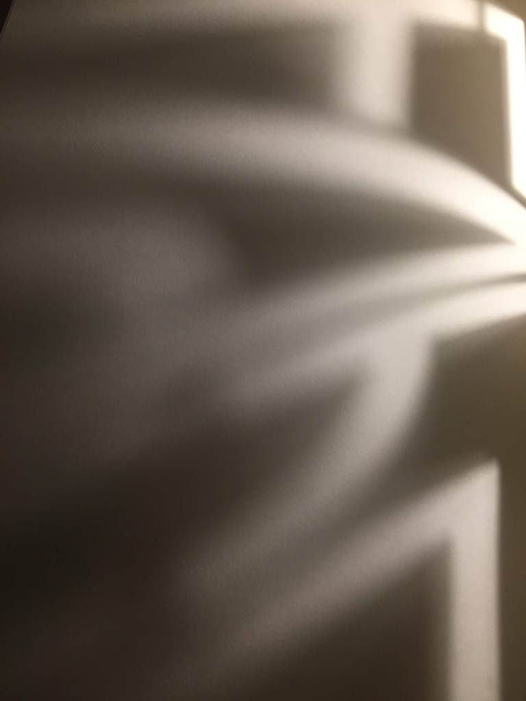
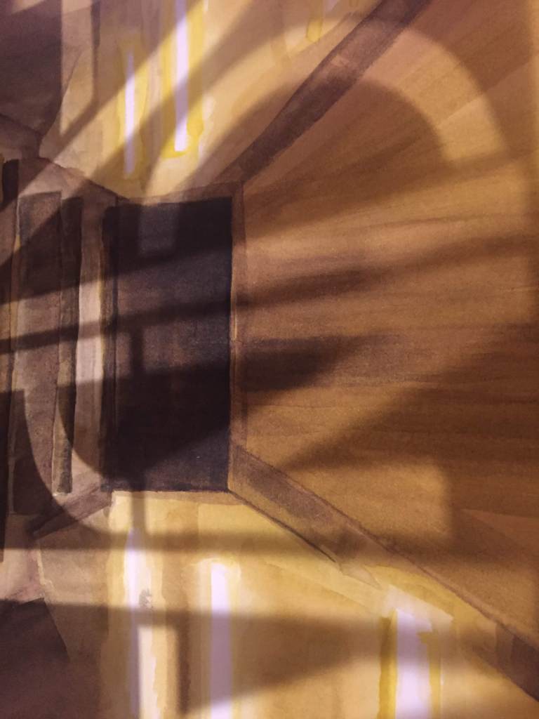
EXPERIMENTING WITH LIGHT AND SHADOW: I found that the cut out I had made created an interesting effect when next to direct light.
Identity: Fine Artist
Completing an introduction to graphic design (a typography workshop) increased my interest in text and its potential uses. But was this in a new graphic design sense, or had I just found a new language/tool to enhance and develop my fine art practise in the future?
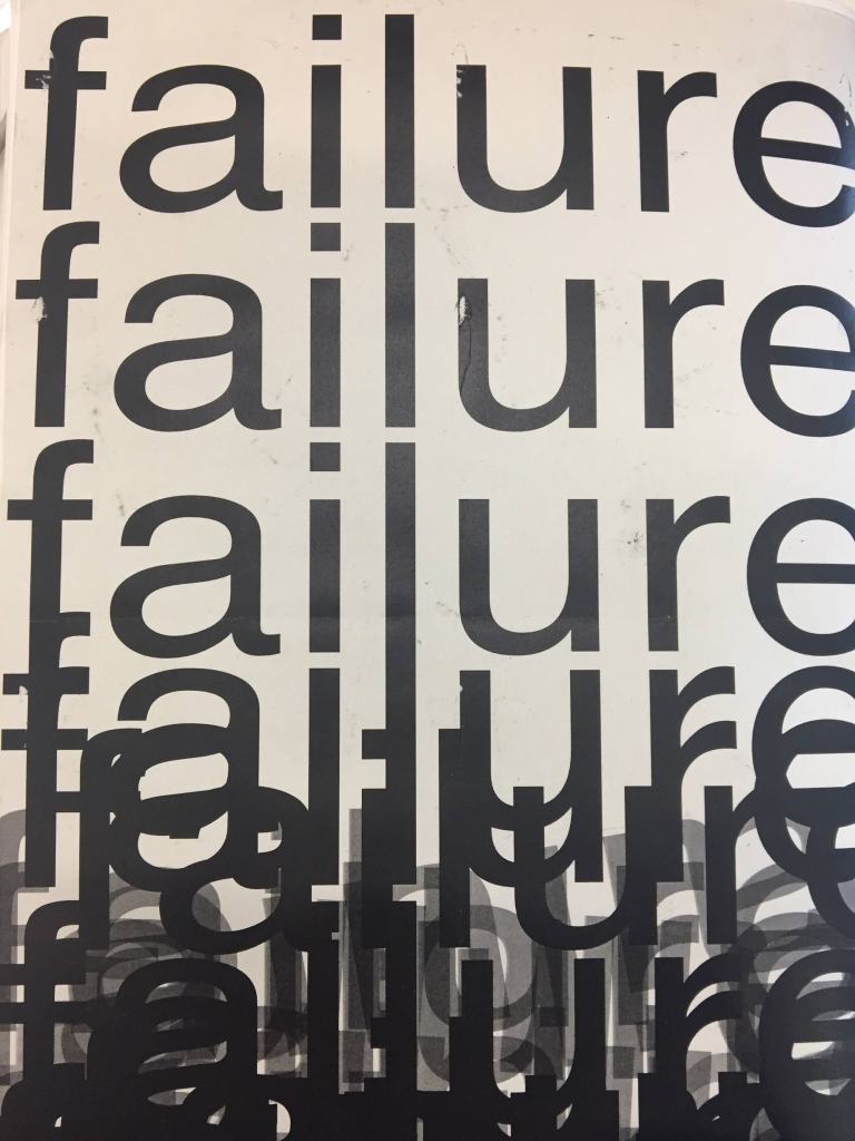
Our brief was to manipulate text in order to represent an allocated word: ‘Failure’. I feel that I initially matched the brief, creating an image that shows the word failing to follow an even layout. The top of the page shows the word repeated in equal spaces. This shifts into the ‘failure’ of this structure at the bottom of the page, where I used random variations of opacity, positioning and layering of the letters. I took a simplistic approach to exactly follow the brief.
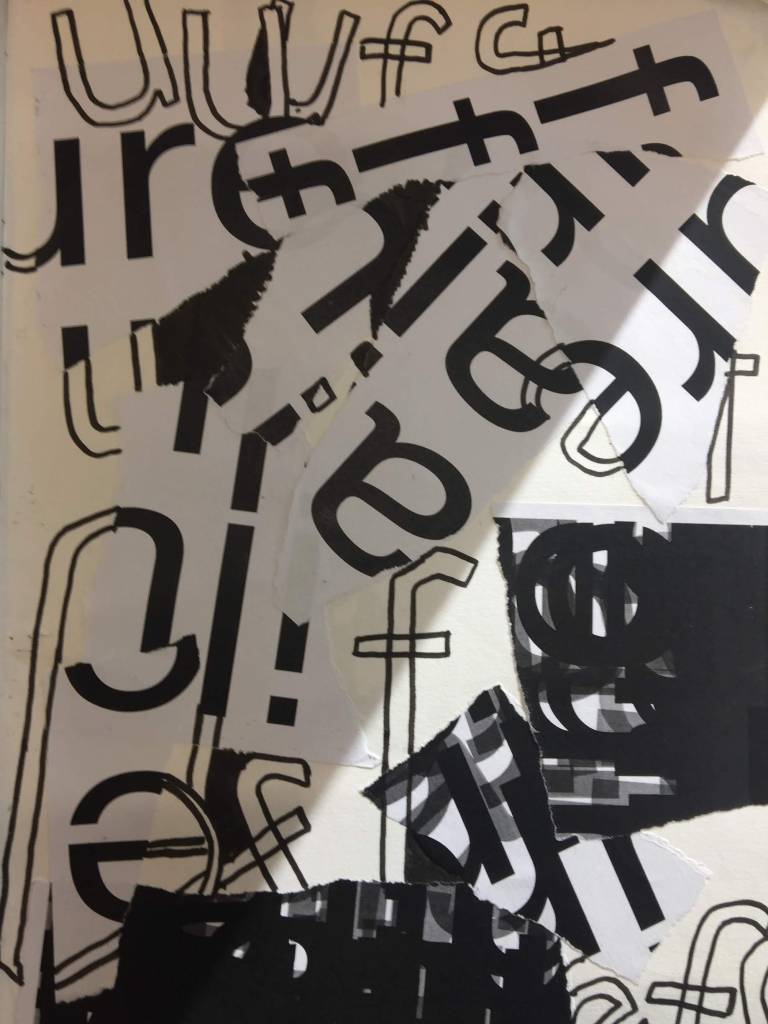
Piet Zwart, a photographer and graphic designer, inspired my first development of this concept. I separated the letters completely by ripping prints of the original typogram and placing them randomly on the page, as well as drawing repetitions of some letters by hand. This takes the knowledge of the original word away, creating what I considered a chaotic image of failure.
At this point, I began to question whether my interest was in creating a graphic image of ‘failure’. I felt conflicted between this and my interest in the concept of using letters (specifically their shapes) separate from the context of the word they belong to as a way of forming an image.
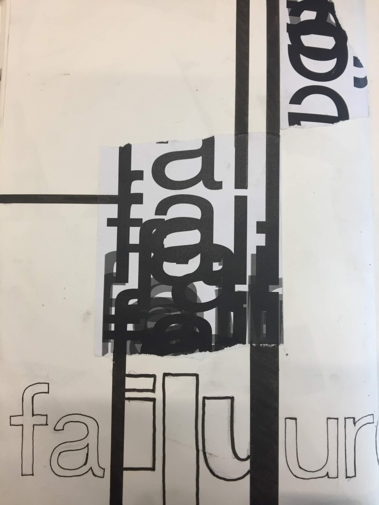
My final development was also inspired by Zwart; his use of horizontal, vertical and diagonal angles of type in his work. This aspect began to interest me in the forefront, as I played around with extending lines from cut-off letters. While I still think this embodies the word ‘Failure’ itself, I am able to question what I really took from this exercise, as I ultimately strayed from the brief.
My conclusion, while still flexible, is that my practise remains in the fine art realm. Graphic design and the techniques it presents can be used in my work as a language to communicate ideas, and create compelling images.
Fine artists such as Barbara Kruger, who uses bold font to spell out the message behind, or formed by, her work exemplify the potential for this cross-disciplinary method. Jenny Holtzer uses text in isolation, forming pictures and other pieces (installations, lighting) made up entirely from language. Modernist poets’ fascination with typographic structure as an element of their writing shows how language and art coincide, and can exist as significant aspects of one another.
DRAWING WITH AN 8 YEAR OLD
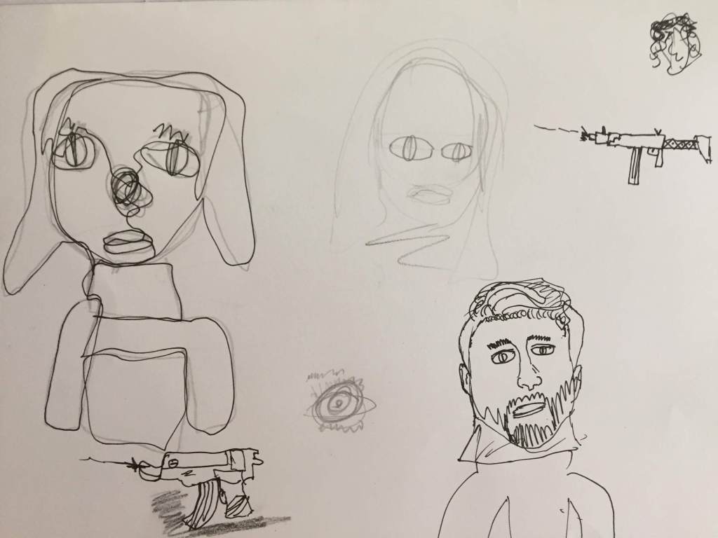
The result of a fairly instructional drawing session with an 8 and 5 year old. Advice on basic proportions was accepted by the older child, who produced remarkably unique illustrative portraits. A continuous line drawing (top left) was my favourite outcome of the two hours spent drawing with children.
Despite an initial desire to learn new techniques and use materials beyond coloured pencil, both boys ended up drawing “cool guns” as they began to lose focus.
DRAWING WORKSHOP
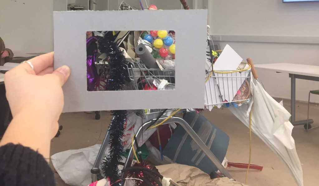
Viewfinder 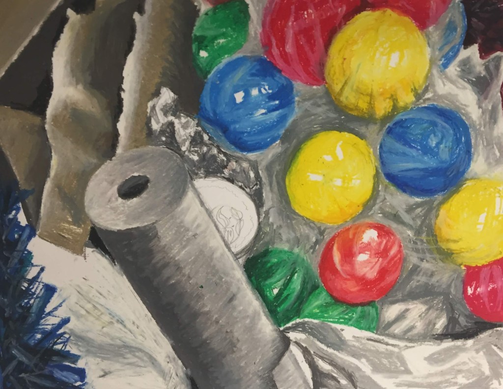
Oil pastel drawing
BRIEF: Use coloured materials to replicate/represent textures seen in “the trolley”.
CUBISM

Using a reference photo (selected from the outcome of a performative workshop) I experimented with different styles of painting. The unplanned nature of the reference photo allowed me to associate this context with the Cubism movement, which strays from the confines of realism.
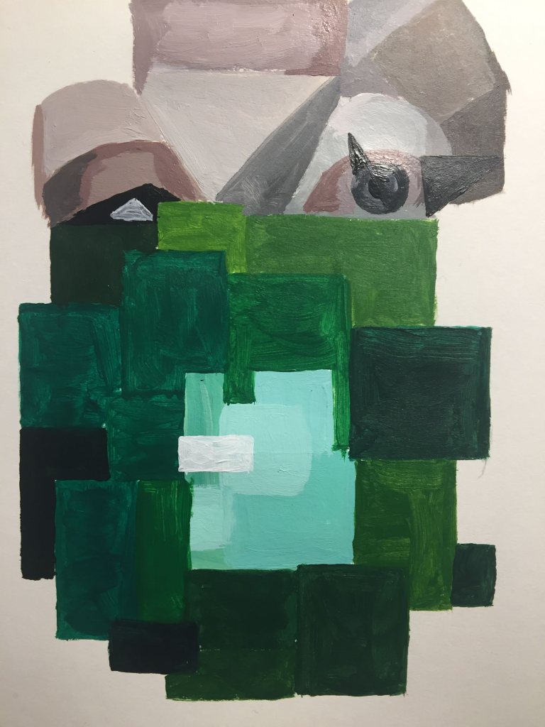
I firstly painted a section of the image in a more realistic style, as I thought this would give me an understanding of the colours involved when I moved into cubism. I left the balloon (object of interest and focal point of the photo) as negative space. This leaves the context of the image ambiguous when separate from the reference photo, which I found made the image more complex.
My second interpretation of the photograph was inspired by both traditional cubist artists and – predominantly – slightly later artists such as Jean Metzinger, who uses wider, flatter 2D shapes of block colour, which produces a piece closer to complete abstraction than that of Picasso’s cubist work. This produced an image that appears pixelated and removes obvious context.
I found I referred back to ‘Colour in the Everyday’ in my use of squares that represent the main colours in the image. This simplified the painting further which meant I could contrast my first painting even more.
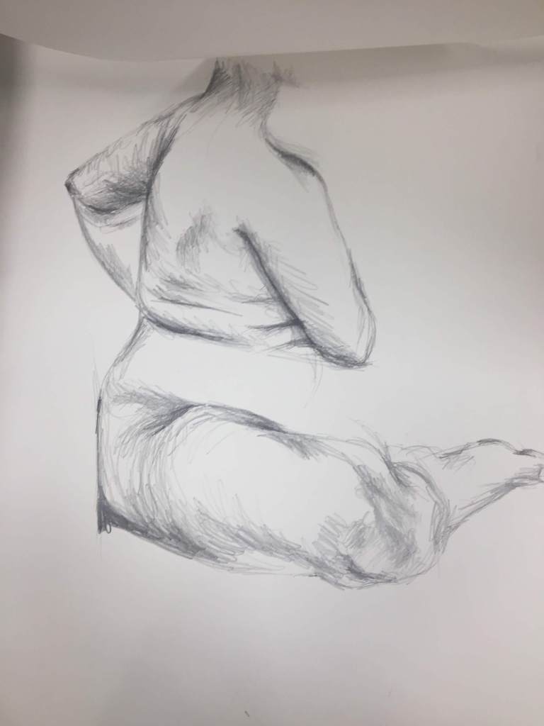
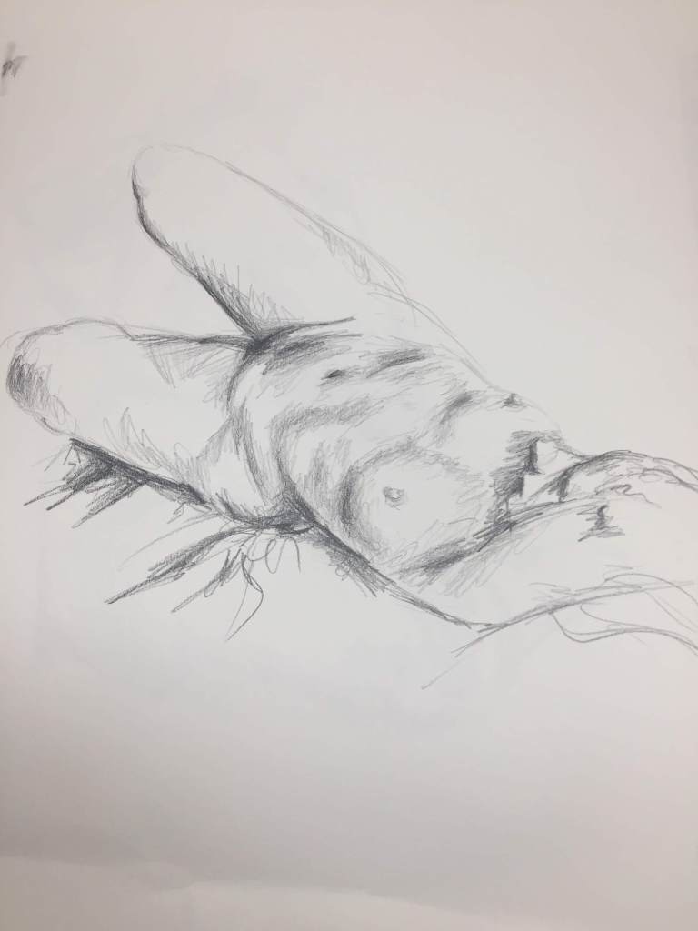
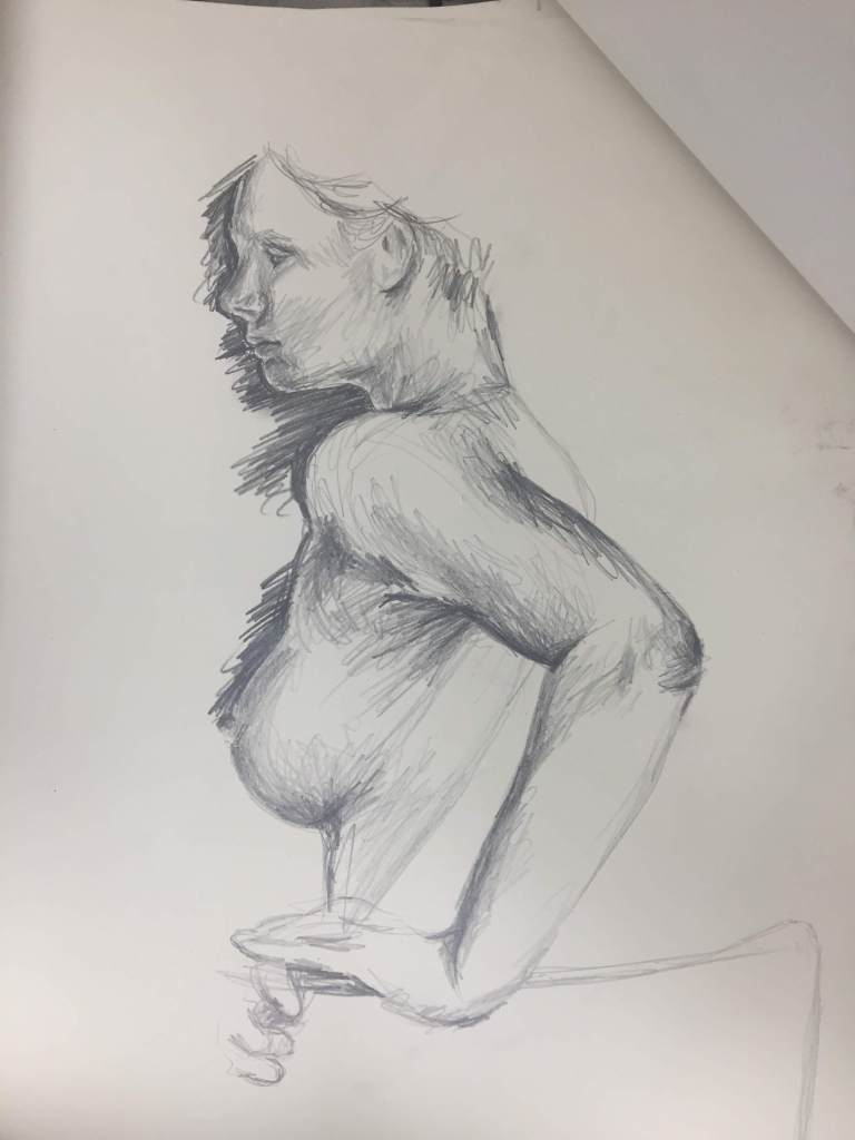
LIFE DRAWING (2)
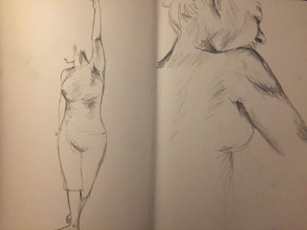
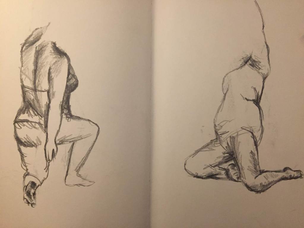
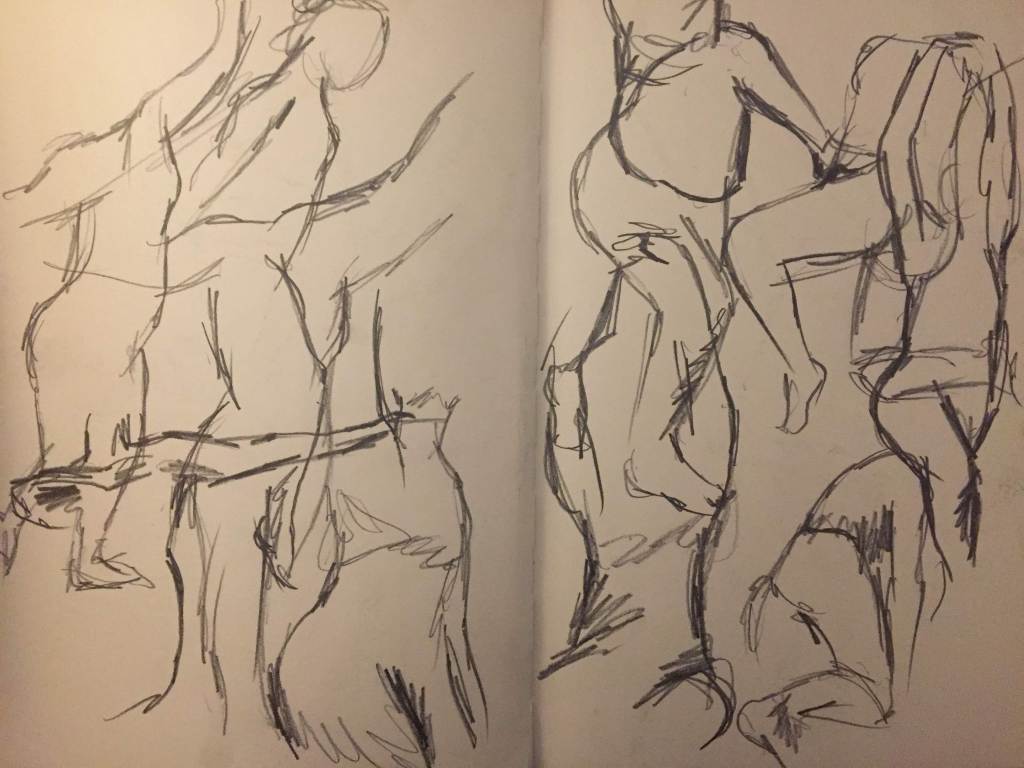
30 second poses (10) 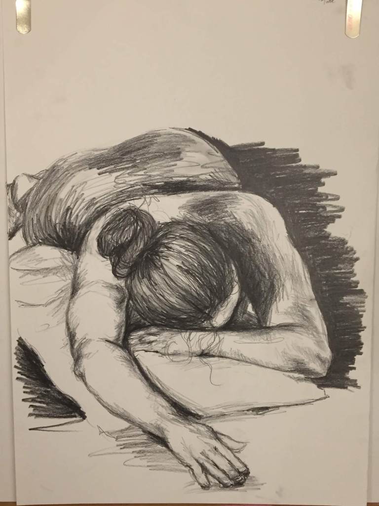
Final drawing of the session: 45 minutes.
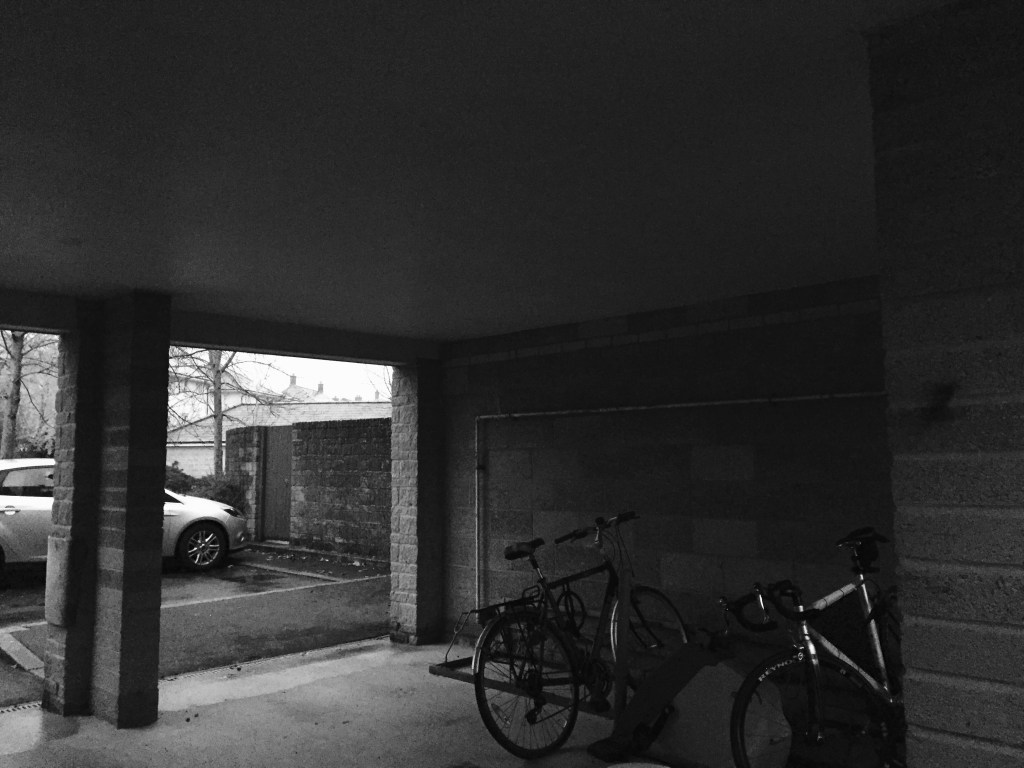
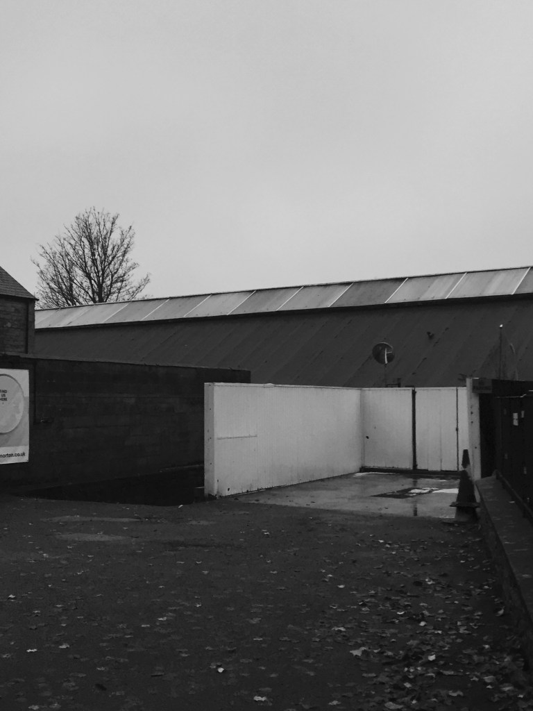
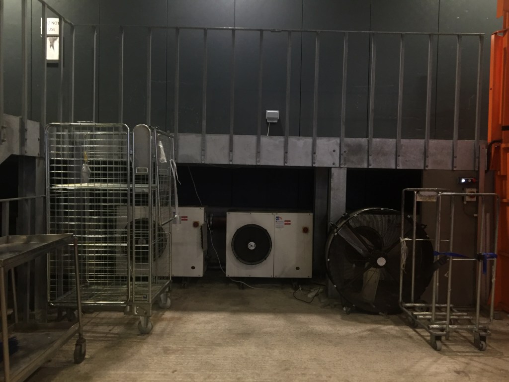
PHOTOGRAPHY
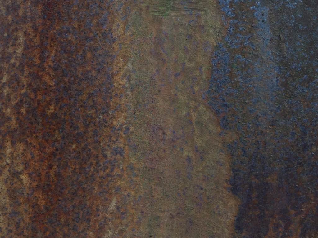
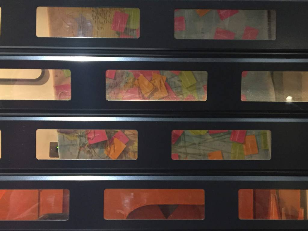

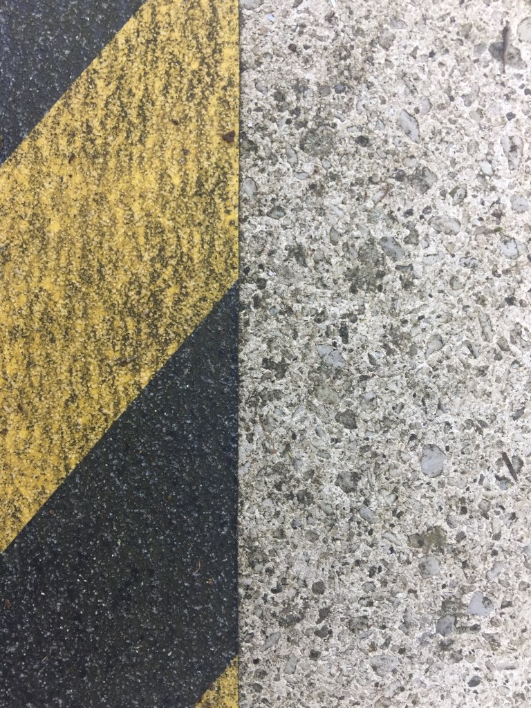
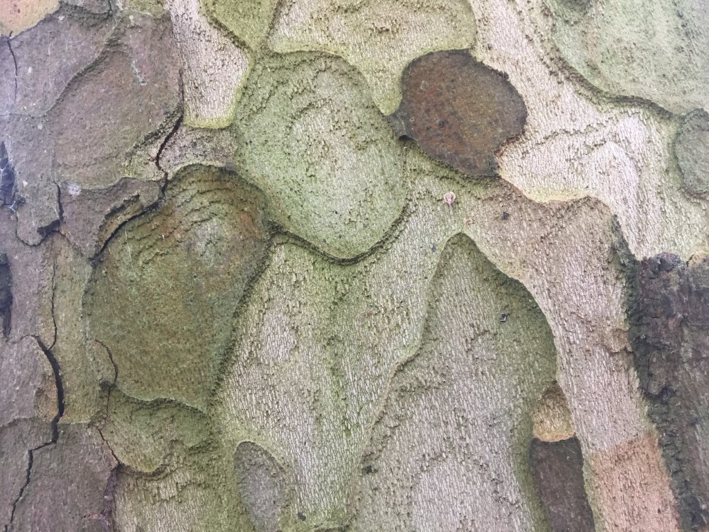
The brief: photograph texture around the campus. I focused on textures that also contained visually pleasing or interesting colours, shapes and lighting. The task of selecting an everyday object to capture close-up and form a complete image from was enjoyable to me. I was motivated to experience the editing process of choosing a collection of photographs I thought were successful and fairly cohesive; I found a contrast of natural and artificial textures interesting when conscious of a colour palette.
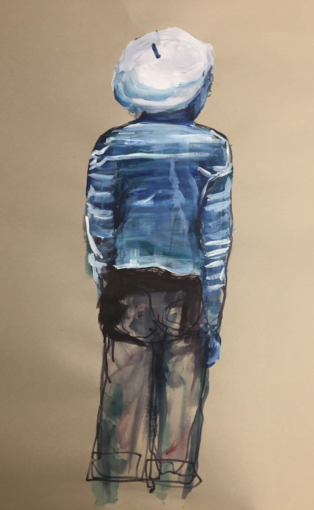
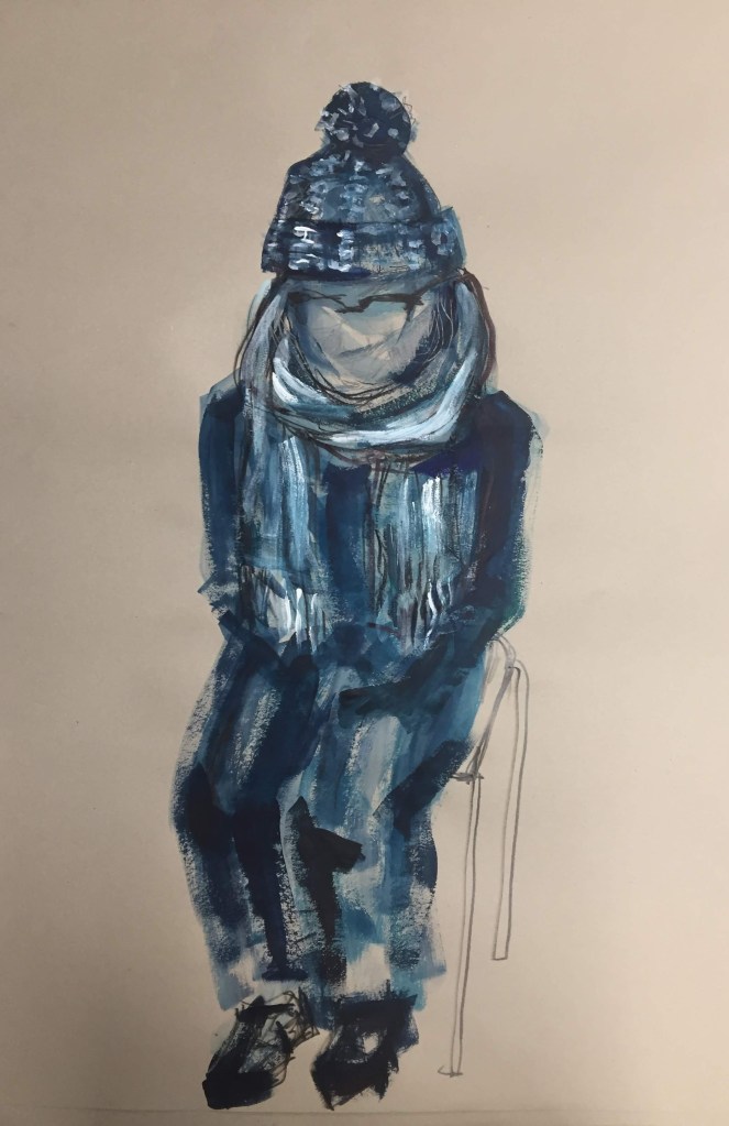
LIFE DRAWING
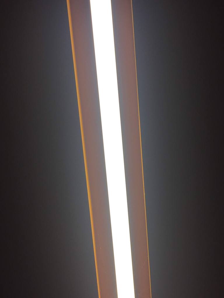
Experimenting with negative space and back lighting